Archives for category: Geo-Politics

Today is a pretty special day in Australia. No it is not because Le Tour de France 2016 starts later tonight (that is a special day for the whole world, not just Australia). Today the whole of Australia voted in our national election to decide on the next government. Some people see this as a hassle, but I reckon it is pretty awesome. When I said the whole of Australia voted, I meant it. Australia is one of the few countries in the world where voting in the national election is compulsory. It means everybody has a say, and everyone’s vote matters. Obviously some votes matter more than others because people are located in seats that are considered “swing” seats.

Election2016_0048

But the reason why I think it is special is that there are so many things about the Australian democracy that we can be thankful for. Firstly, the elections are run professionally by the Australian Electoral Commission (AEC) in exactly the same way across every State and seat in the country. They are a totally independent body from the government of the day and run things pretty smoothly. If they get things wrong it is a national scandal, but they don’t really do that. The AEC do a very good job in making it easy to vote and removing any blockers for Australians to cast their vote. Probably the most important function of the AEC is that they are the ones who call the election – not some invariably biased news media company.

Second, our election day is always held on a Saturday so that nobody has to sacrifice their work time (unless they work weekends) to vote. Even if they do have work commitments on the day, they can vote early via postal or pre-polling booths. For this election over 2 million people have voted before election day, and it looks like that number will keep getting higher.

Election2016_0046

Third, our polling booths are safe. There is no heavy police presence at any of the booths, and for the most part the local community primary schools are the venues. There is no risk of people being attacked at the booth, no risk of a terrorist incident, and no need for an independent United Nations force to help ensure that the election is fair and free of corruption. More importantly there is no chance of me getting attacked because I vote for one party over another (a lesson that Mr Trump could learn).

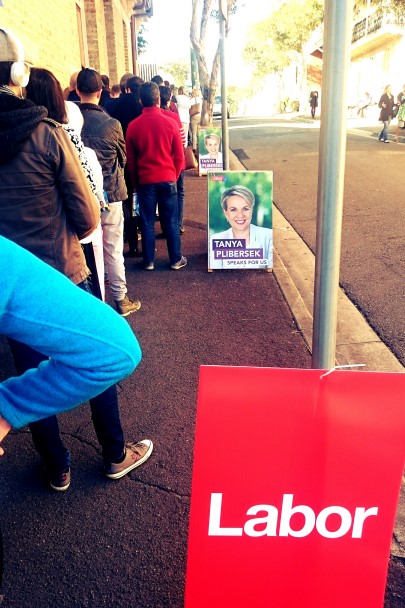
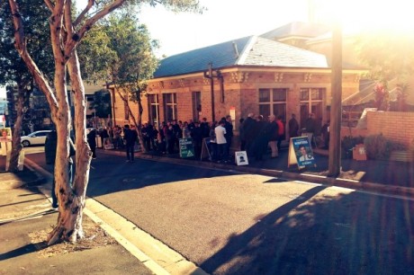
Fourth, because the polling stations are held in central locations within our communities it is an opportunity to bump into local friends. While I voted this morning I bumped into three people I knew and had a good old chat. This community atmosphere is prevalent everywhere, where everybody acknowledges what we have come together to do. And people are patient too, as I found out this morning – my queue was longer than I have previously experienced, but there was no impatience as everybody understood that we were all “in the same boat”.

Election2016_0049

Fifth, many polling stations have a sausage sizzle! There is even a website that tells you which ones will have a sausage sizzle. Volunteers quite often man the grill, and the funds raised go to the local community facilities. I went early this morning so skipped the sausage sizzle, I will have to make up for it tomorrow at Bunnings Warehouse.

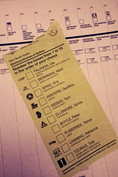
Sixth, we have more than just two parties putting their hand up to represent the people. While practically only one of two parties will be able to form government (Labor [left] or Liberal [right]), there are many viable alternatives that can represent the many walks of life within the electorate. There are some properly “bat shit” crazy parties on one policy platform positions but because everybody has to vote the well tuned Australian BS detector does its job. For the independents that do get up, they typically punch well above their weight and represent well their electorates.

Lastly, in the round up we know that whoever wins the election we will not wake up tomorrow with our country drifting towards a dictatorship or police state.

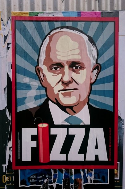
All up we are pretty lucky as Australians, in a free and liberal democracy with well established institutions of state that protect us all. This guy below is favoured to win as I write this post. Let’s hope for him that his fortunes change and the political comment in this photo does not ring true for the next term of government.

Election2016_0036

P.S. election out of the way, bring on Le Tour!

I woke up this morning to the shocking news of the attack in Istanbul, Turkey. Like the attack earlier this year in Belgium, I was aghast at the horror of the attack. But my immediate thoughts went to a work colleague who Turkish by background, but currently resides in Australia. When I got into the office I checked in with him to see if all his family and friends were safe. Fortunately they were.

Then he told me of a statistic that I did not realise was true. Since the beginning of 2016 there have been hundreds of terrorism related deaths. At first I didn’t believe it, but then the reality sunk in. Living in a wealthy first world Western country we have very blinkered media coverage about what is going on overseas. I did some digging and found a Wikipedia article listing all the global acts of terrorism for 2016. Based on the count from this article, to date there have been over 250 deaths in Turkey with many times that number injured. That number will only increase after the airport attack.

Shocked cannot begin to describe the feeling I had in uncovering this morbid statistic. March and April were nasty, and had close to 30 attacks combined. I knew the situation in Iraq, Afghanistan, and Somalia was appalling, but the situation in Turkey and Pakistan is bad.

I could pass judgement on the political situation that Turkey is in, but that does not make any better the senseless slaughter of innocent people in this attack. On top of that Turkey, along with Jordan, is shouldering a ridiculous amount of the refugee burden coming out of the Syria conflict (over 2 million).  And now Turkey is squarely in the sights of IS following their approval for use of their Air Force bases for attacks on IS.

What is quite clear is the demonic nature of the attackers, clearly targeting indiscriminately people of all religions. To top it off, the attack occurred during Ramadan and just over a week from Eid. I am Catholic, so the way I could equate this is as if a group of fundamentalist Christians performed a mass attack on other Christians in the lead up to Christmas.

For my work colleague it is another sad day for his country of birth. He has trouble communicating this sadness to people oblivious to the challenges overseas. But I think this one image speaks volumes to the problem, and the challenges of a blinkered view of the world. I will let you be your own judge against this sketch.

IMG_20160629_133514

I don’t normally write about this sort of stuff, but I could not stop thinking about this today. Like I did for Paris, I say a prayer for Turkey.

This is a strange post that may seem like a lesson in geography and politics, but bare with me.

Our son, AKA “The Pok” has become interested in all things maps. His thirst for geography is unquenchable. This is not really a surprise given he has family in the UK, Canada, and New Zealand in addition to the numerous stamps in his passport. So when my wife said let’s get him a map of the world for his bedroom I was keen to get it up on the wall.

What my wife found on eBay was not a map on a poster but a map in wall decals. I was not too pleased with this as my concern was with not getting the space right between land masses (call me picky). But it was a good idea and my better half convinced me that it would be fun for him to have the power over plate tectonics on his wall.

This “map” arrived late last week and when I was out running errands over the weekend my wife enlisted the help of my parents to install it. When I got back I was briefed on the arguments between the three adults and the fun that the three year old had. But I had to inspect their handiwork. Here is the finished result:

IMG_3083

On first glance not bad. My initial point of objection was only in their Southwesterly placement of Australia relative to Papua New Guinea (the narrow Torres Strait). But on closer inspection there were more disturbing “errors”. Here is a zoom in of Asia / Oceania:

IMG_3084

The first horrific error is the name of the country North of China (and the raison d’etre for the Great Wall of China). Mongolia is not Mongoloid! The second error, which has to be driven out of geopolitical hatred between China (and Korea) and Japan is the completely disproportionate size of Japan to both China and South Korea – its tiny!  Never mind the reality that the land mass of Japan is over 3 times that of South Korea and its marine geographic reach goes as far North as the Russian region of the Kamchatka peninsula. Another horrific error is the diminution of the Indochinese countries (Vietnam, Cambodia, Laos) and the ignoring of Myanmar – and these are all replaced with one country, Thailand. This might have something to do with the continuing territorial disputes that China has with pretty much every one of these countries. BTW – Myanmar is bigger than Thailand as well. What also is funny with this map is where they choose to put the mountains in Northern Russia, particularly given that Asia is the continent that hosts Earth’s tallest mountain range, the Himalayas. I could continue with other points of bizarreness like what made the “cartographer” choose certain cultural icons to represent countries, like yoga for Indians and ballet and babushka dolls for Russians – surely there is something more culturally significant than some of these things.

If I zoom into the European / Middle Eastern / African third of the map, the bizarreness continues:

img_3085

The “map” uses what appears to be a Mercator projection which means the size of the land masses nearing the poles are disproportionately larger to their actual size. Africa is the largest continent by land area in the world and its cultural significance is far beyond savanna animals and pyramids. Africa is so big as a land mass that it could swallow up 6 of the G8 countries (or 6 of the G7 countries if the crisis in the Ukraine continues to play out). This image gives a much clearer idea of the scale of land mass, an inconvenient truth perhaps (the image is courtesy of the site Live Learn Evolve and uses a Peters projection).

Africa-true-size-peters-projection


Africa is where humankind first started walking and has the largest desert in the world in the Sahara. You would think that an absence of trees (and not every tree in Africa is a palm) in the Sahara would also be relevant. But maybe this is a reflection of general Chinese cultural perceptions of Africa. The choice of countries they denoted is strange too. Economically, Nigeria is the largest in Africa, but omitted – and the minor fact that there are over 170 million people in the country with over 20 million living in Lagos alone.

If I go onto the Middle East, Turkey (which is obviously culturally significant because of camels) must be happy with its conquest of Lebanon, Israel, Palestine, Jordan, and Syria. Saudi Arabia now appears to be the home of the Burj-al-Arab and not Mecca (sorry Dubai). Looks like the Persians finally conquered Iraq (whose significance to all of us is not Saddam Hussein but in being the cradle of civilization, Mesopotamia).

Europe is just totally weird – fishermen in Ireland, Santa in Lapland, Finland. Again the Mercator projection causes havoc with the size of the land masses. Based on this view Russia is HUGE and Europe is comparable in size to Africa. It would also appear that many of Europe’s cultural icons are from the Victorian era.

Here is the zoom into the Americas.

img_3086

Again the choices (or more the omissions) of which is interesting, namely the absence of Chile, Bolivia, and Venezuela. While I recognise that Brazil is famous for its footballing prowess, perhaps its bigger global significance is that it is the home of the Amazon, along with its neighbours.

North America is reduced in its significance as well. Mexico is the home to pyramid building cultures of the same historic importance as well, namely the Maya and the Aztecs, yet what is deemed more important is the cowboy lifestyle. It would also appear that Mexico is also swallowing up most of Latin America as well (sorry to Panama, Belize, et al). Hollywood is culturally significant for the USA but I would say that San Francisco with its proximity to Silicon Valley is more important globally. The USA is also the home of the bald eagle and brown bears. There is a funny icon image that I am assuming is the Grand Canyon. And Alaska is not the home of parachuting… bizarre. Canada is a huge land with again very important forests and the home of the Inuit. And where they chose to locate the city icon (I think that looks like the Toronto skyline) there are no great cities. The Great Lakes are missing as well. What is missing from both of the Americas are their very important mountain ranges – the Andes and the Rockies (the longest and the second longest).

All up this map is strange and I am not sure this is what I want my son absorbing. It gives culturally misleading messages and does not portray the real size of the world in anyway. My son’s brain is a sponge and if I feed him complexity he will absorb it and remember it for life. I just have to find a better way to present that.

It has to be strange being Australian and having an intense fascination in the US election of 2012. But when I look at the reasons why, it isn’t that strange. The USA is the most powerful country in the world, economically, militarily, in innovation, and its culture pervades every corner of the globe. A news site described election watching as the ultimate reality TV show. Though it would have been more fun watching the Republican primaries hosted on the set of Survivor Vanuatu! I have found myself consuming an inordinate amount of election updates. For anyone with an analytical mind – it is like candy. There are statistics, probabilities, scenarios, segmentation analysis, and with it all overlaid on a timeline counting down to today.

I won’t espouse my opinion on who I think should win, because I believe that this is the domain of the American people. It is their election, even though it has an impact on the world. After all the great majority of the outcomes will directly affect the day to day lives of Americans and not myself. Us foreigners are indirectly affected by the outcomes, and our own governments have huge impact as to how greatly we are indirectly impacted (when was the last time the US sent a drone strike into New Zealand?). But the election has driven me to digitally subscribe to the New York Times.

In the past 6 months I have become addicted to reading Nate Silver’s blog on the NYTimes – The FiveThirtyEight Blog. I am now super curious as to whether he has got it right. I’ve been intensely reading the detailed analysis and the cold math that he applies in his blog. And it is strangely non-partisan (Fox News, MSNBC anyone?). It still incites partisan feedback, but he keeps on bringing it back to “look at the math”. But the coolest thing about the blog, and some of the other pages on NYTimes are the graphics. Check out this eye candy from a few weeks ago – FiveThirtyEight Blog – Over the Decades, How States have Shifted. It is a beautifully complex picture that conveys a lot into a simple diagram. The NYTimes on another part of the site laid out the scenarios as they present themselves – have a look at 512 Paths to the White House.

There is other eye candy on other sites too, which are also interactive. CNN allowed me to pick the election via my tips for how the states would fall in the electoral college – CNN 2012 Electoral Map (which is similar to the “Paths” link on the NYTimes). Looking purely at the math, it does not stack up well for the red side.

I like this eye candy, and have often had to employ similar techniques in the presentation of information or concepts at work. A fantastic site that I have referenced many times in the past for inspiration is Visual Complexity – http://www.visualcomplexity.com/vc/. I first stumbled across this site back in 2005. It is pure eye candy, with a real purpose and I could get lost for hours there. And when shooting photos and capturing the world around you, sometimes you get a hint as to where their inspiration has come from.

I just hope for two outcomes from the election – foreign policy remains pragmatic and progressive by bringing countries together, and the American people can bridge the deep partisan divisions that have engulfed the country for over the last decade. After all, without combined ambitions of the USA the human race would still not have landed on the moon – or invented velcro.

Dawn photo shoot photos to come (with a bit of assistance from Photoshop), and a little video surprise from my photo partner in crime Grumpy.

UPDATE

I guess Nate Silver pretty much picked it, though there have been a couple of surprises in the swing states. What did surprise me a little bit was CNN saying how unexpected it was to get such a quick result. The math should have told them that if Ohio and a couple of the other Eastern swing states went blue, red had buckley’s chance of winning. It remains to be seen whether Florida in the final mix stays blue or goes red, but at the moment it has a very azure haze to the count.

I suppose one last note – I couldn’t let this post rest without picking my photo of the election campaign. For me this one captured by Forbes spoke volumes to what is involved in running for re-election.

President Barack Obama alighting from Air Force One on a campaign stop